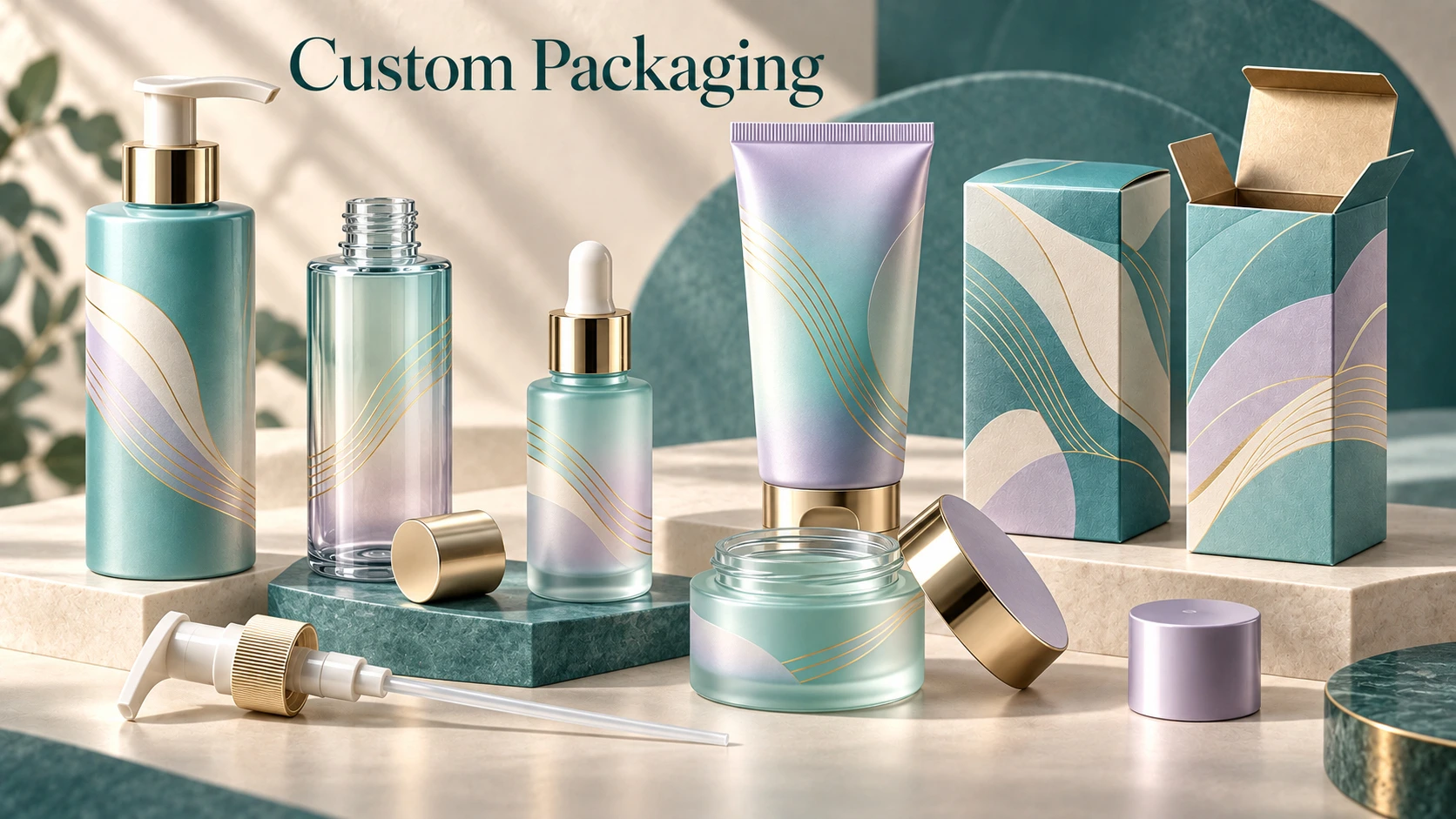
Foil, embossing or spot UV: choose the right carton finish.
A premium carton begins with a readable design and suitable structure. Finishes then add emphasis and tactile character. Knowing which effect comes from the paper, printing, a coating or relief makes the specification much clearer.

1. Start with structure and paper.
A folding carton is formed from cut and creased board; a rigid gift box uses a different construction. Specify the product dimensions, arrangement and insert needs before choosing the finish. A beautiful surface cannot resolve an unsuitable fit or unclear opening experience.
Next, identify the paper or board and the intended surface character. The packaging and carton atlas distinguishes a paper’s texture from added coatings and transferred decorative foil. If a reference looks textured, ask whether the effect belongs to the substrate or is produced in a later operation.
2. Understand what each finish changes.
| Finish | What it does | What to verify |
|---|---|---|
| Hot foil stamping | Transfers a decorative foil using heat and pressure. | Foil type, placement, fine detail and adhesion on the selected surface. |
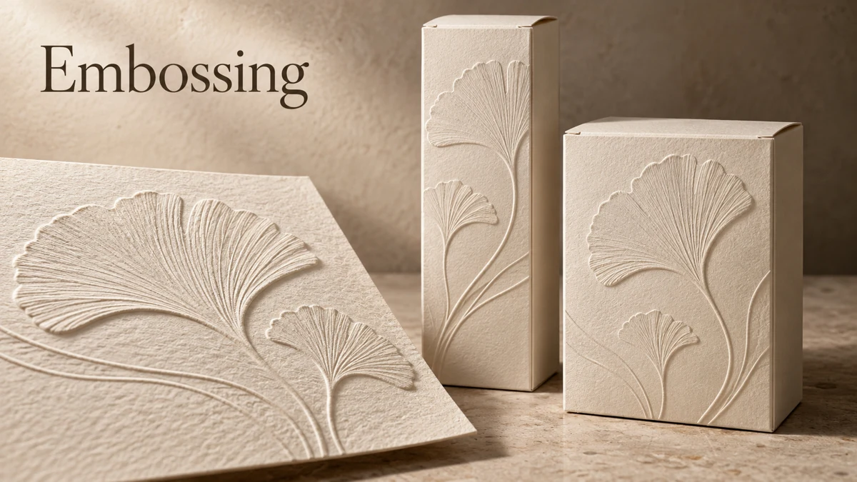
| Embossing / debossing | Creates raised / recessed relief in the substrate. | Relief direction, depth and interaction with folds or other decoration. |
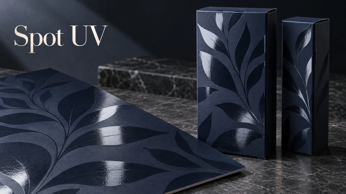
| Spot UV | Applies a UV-cured coating selectively for contrast. | Coating area, gloss or texture, and alignment with the printed graphics. |
| Film lamination | Bonds a film to the paper or board surface. | Film specification, optical or tactile effect and compatibility with later operations. |
| Spot colour | Uses a separately formulated ink. | Colour reference, substrate and the approved printed proof. |
These terms are not interchangeable. A reflective gold graphic may be printed or foiled; a matte surface is not necessarily soft-touch; and a shiny raised coating is not the same as paper embossing. Describe the intended operation as well as the desired appearance.
3. Give every finish a purpose.
Use the strongest finish to emphasise the brand or product identity, then allow quieter areas for the information customers need to read. Combining foil, relief and gloss everywhere can make hierarchy harder to understand and makes the specification more complicated.
Keep the design layers separate. Identify printed artwork, foil areas, relief and selective coating in the production files. Ask the converter to confirm the feasible sequence and alignment requirements for the chosen material. Combined finishes describe a coordinated design, not one universal production method.
4. Review the physical proof.
Review the proof under suitable lighting and handle it as the customer would. Check opening, fit, folds, small text, colour, alignment and the tactile areas. Confirm whether the reviewed item represents the final material and decoration or only the structure.
- The approved structure and dimensions.
- Paper or board and surface specification.
- Colour and decoration layers.
- The physical proof reference and requested changes.
- Approval owner and production-file version.
The terminology in this article is informed by the supplied packaging and carton printing atlas, including its sections on folding cartons, rigid boxes, spot UV, relief, foil, lamination and combined finishes. Use the terminology to request a practical proposal; the actual options and feasibility must be confirmed for the project.
Sources & further reading
Practical examples and checklists are editorial guidance. The references below support the technical background and company information.
- Fedrigoni Special Papers — Glossary
Paper and printing terminology, including relief and surface texture.
Additional terminology source: the supplied Packaging & Carton Printing professional atlas, P13–P14, C01–C12 and terminology notes.